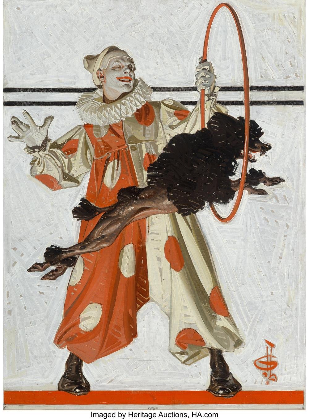
The Visual Language of Zazà
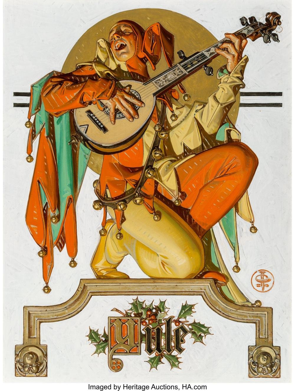
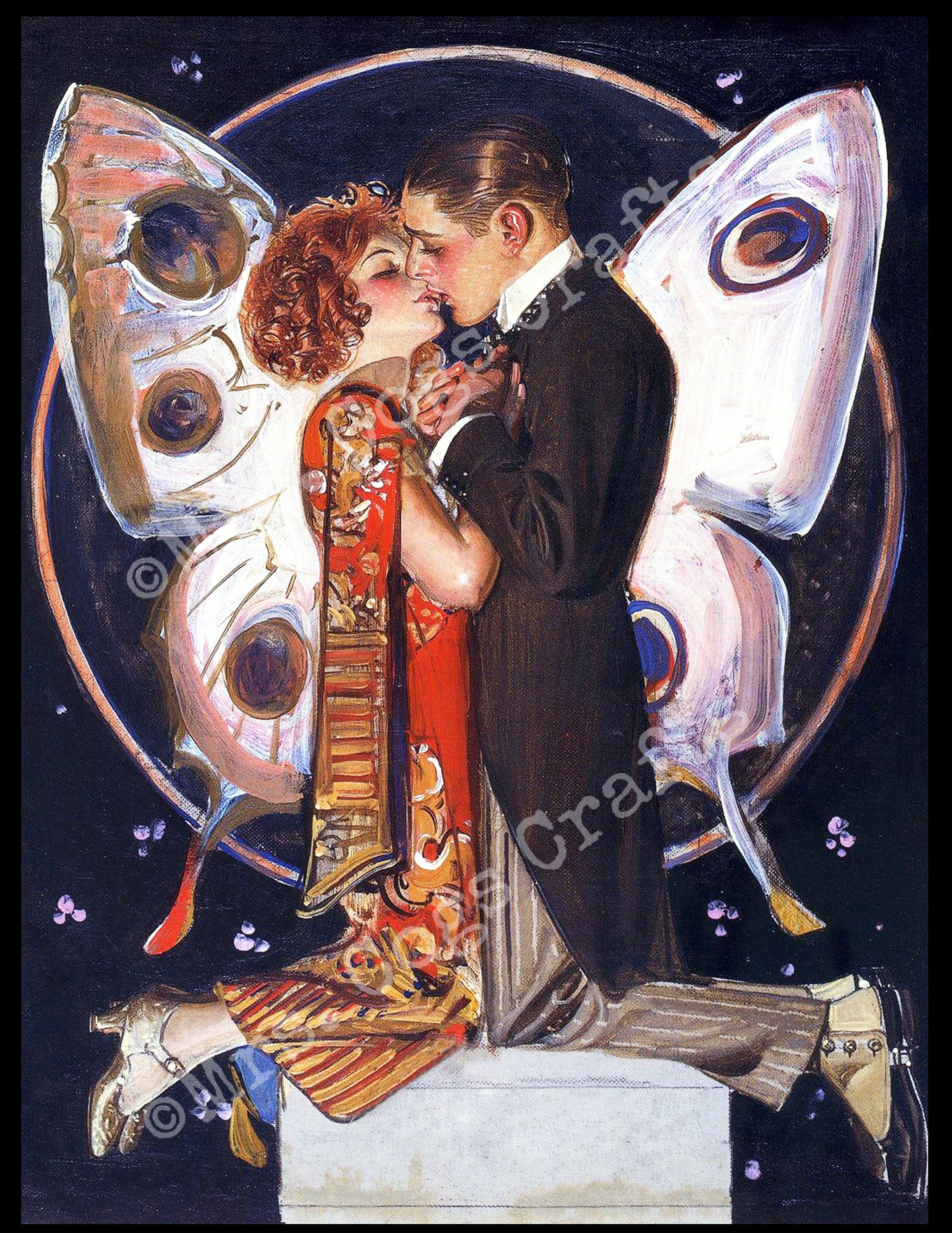
For each show I direct, I look for visual and aesthetic influences to shape the world and concept of the show. As a lover of visual art, this is an opportunity to include works by artists that inspire me in the world-building process. For Zazà I settled on two influential pioneers of commercial art. I have always loved browsing through fin-de-siècle and early 20th century opera and theatre posters. The stark contrast created by the printing limitations of the time period creates a beautiful disparity and a distinct character. Alphonse Mucha was a Czech immigrant in Paris and a pioneer of the French art nouveau movement. He found a balance between high art and commercial art and became very famous for his distinct style. J.C. Leyendecker was brilliant illustrator that made his mark for over 40 years as an illustrator of ads and magazine covers. He famously completed many covers for the Saturday Evening Post, was an enormous influence on Norman Rockwell, and created the quintessential American male with his commissions for the Arrow Collar menswear brand.

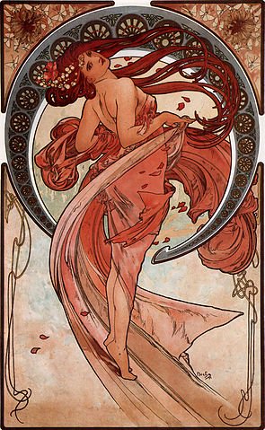
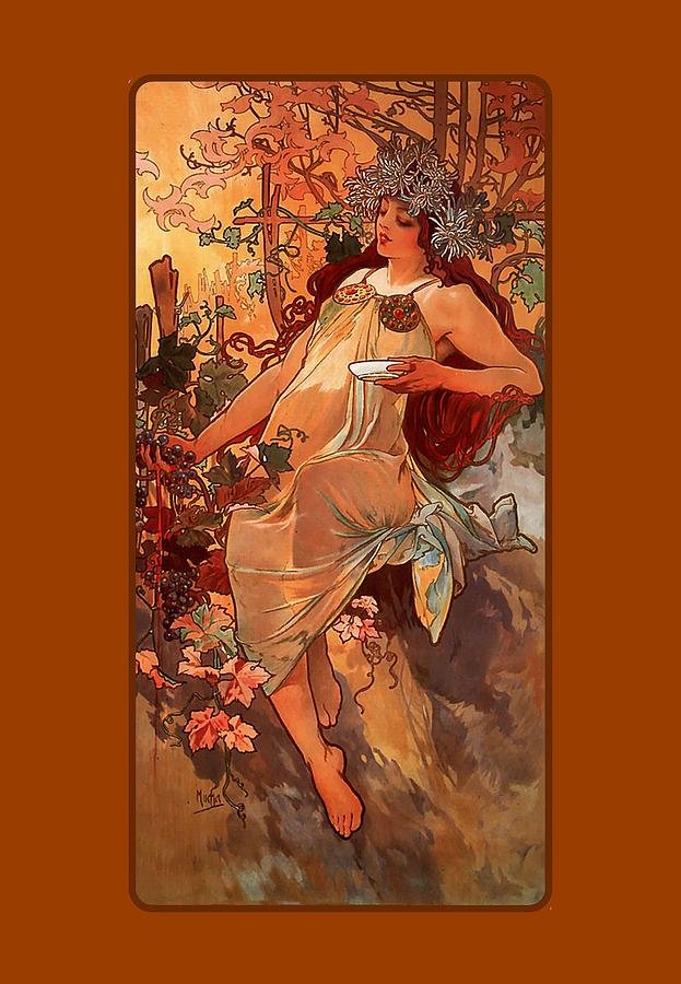
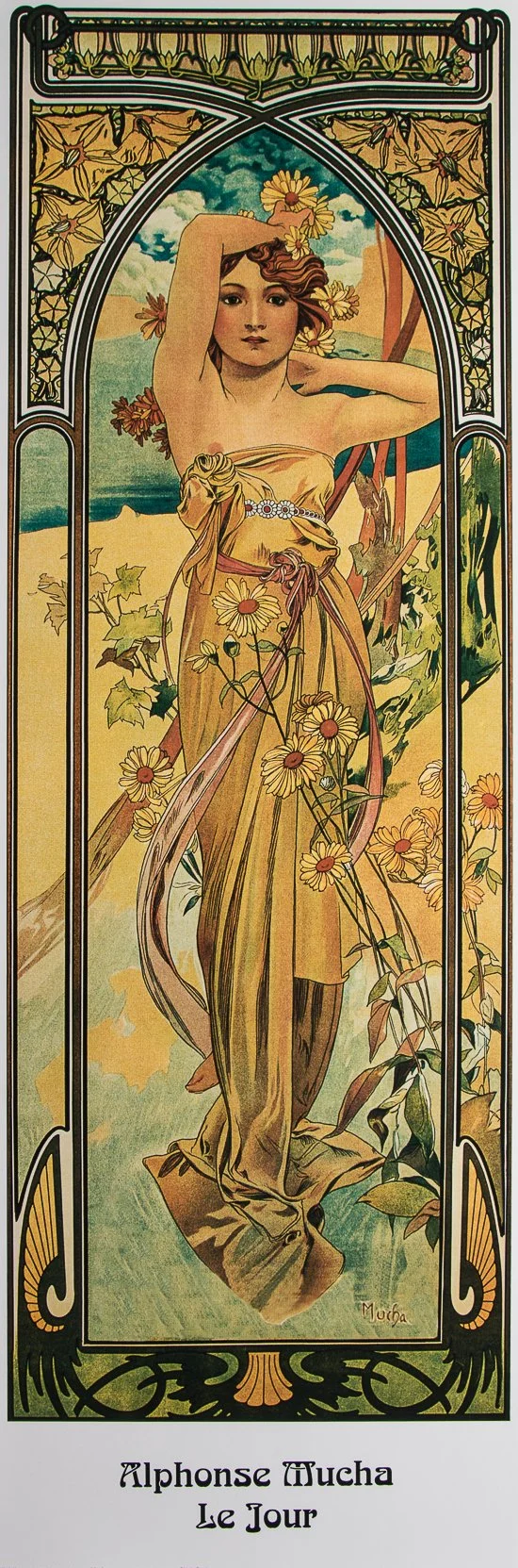
Mucha. Dusk, 1899. color lithograph 68x103 cm
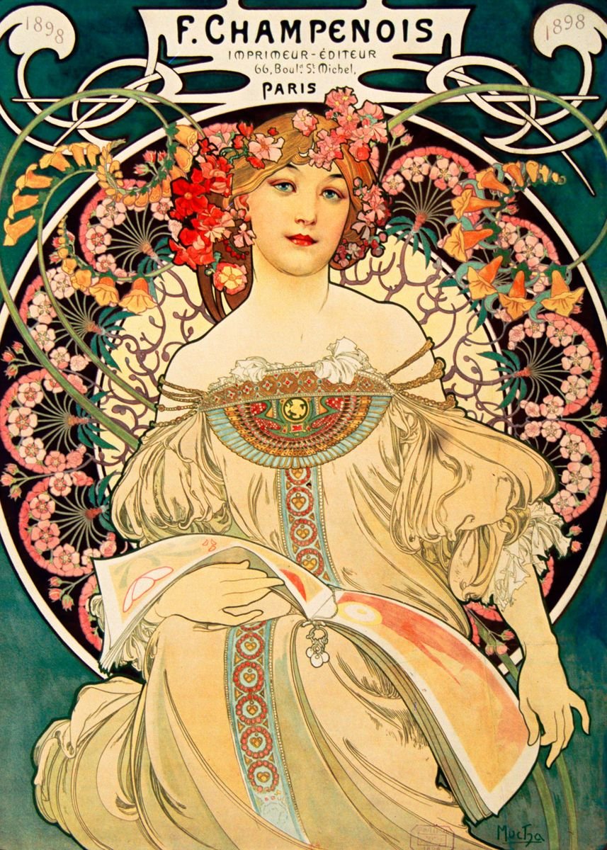
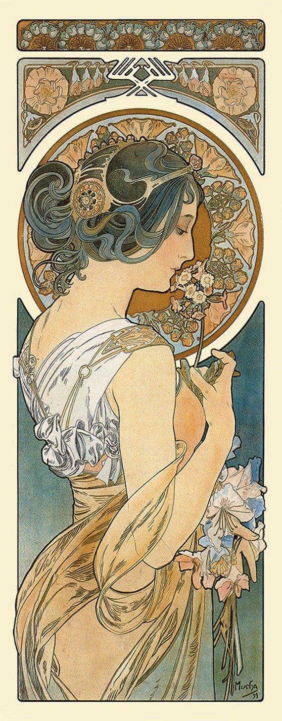
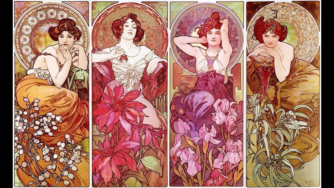
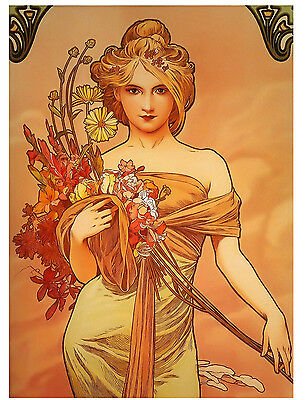
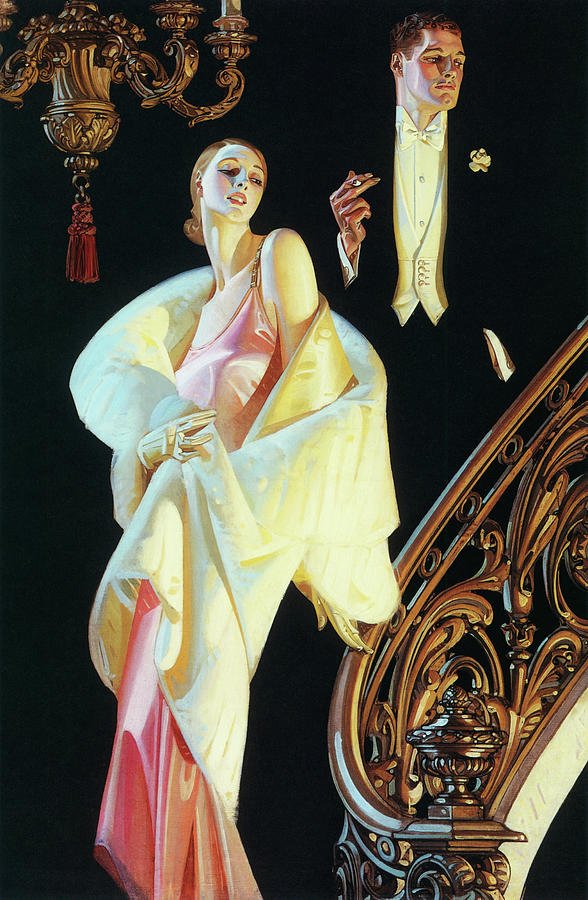
Where Leyendecker is famous for his depiction of the male form, Mucha is famous for his beautiful women and ornate flora and art deco style ornamentations. A soft and passionate color scheme of pinks, reds, browns, and flesh tones is consistent throughout his work and inspired me as a symbol for Zazà. She is idealistic, passionate and full of life with a naivété that proves to be the cause of much suffering. She is organic, complex, forgiving and trusting for better or worse.

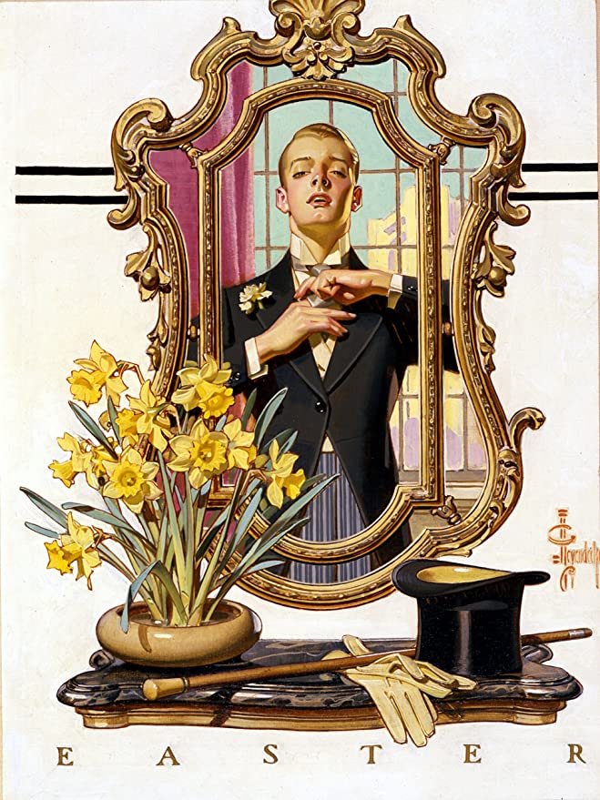
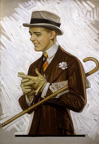
Leyendecker, Men Reading. 1914. Oil on canvas. 19x39”. Arrow Collar advertisement.
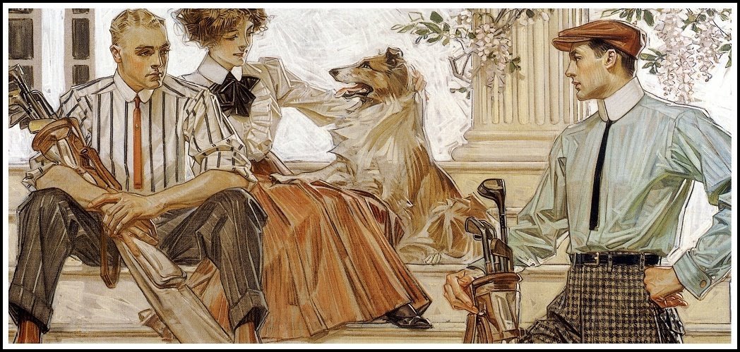
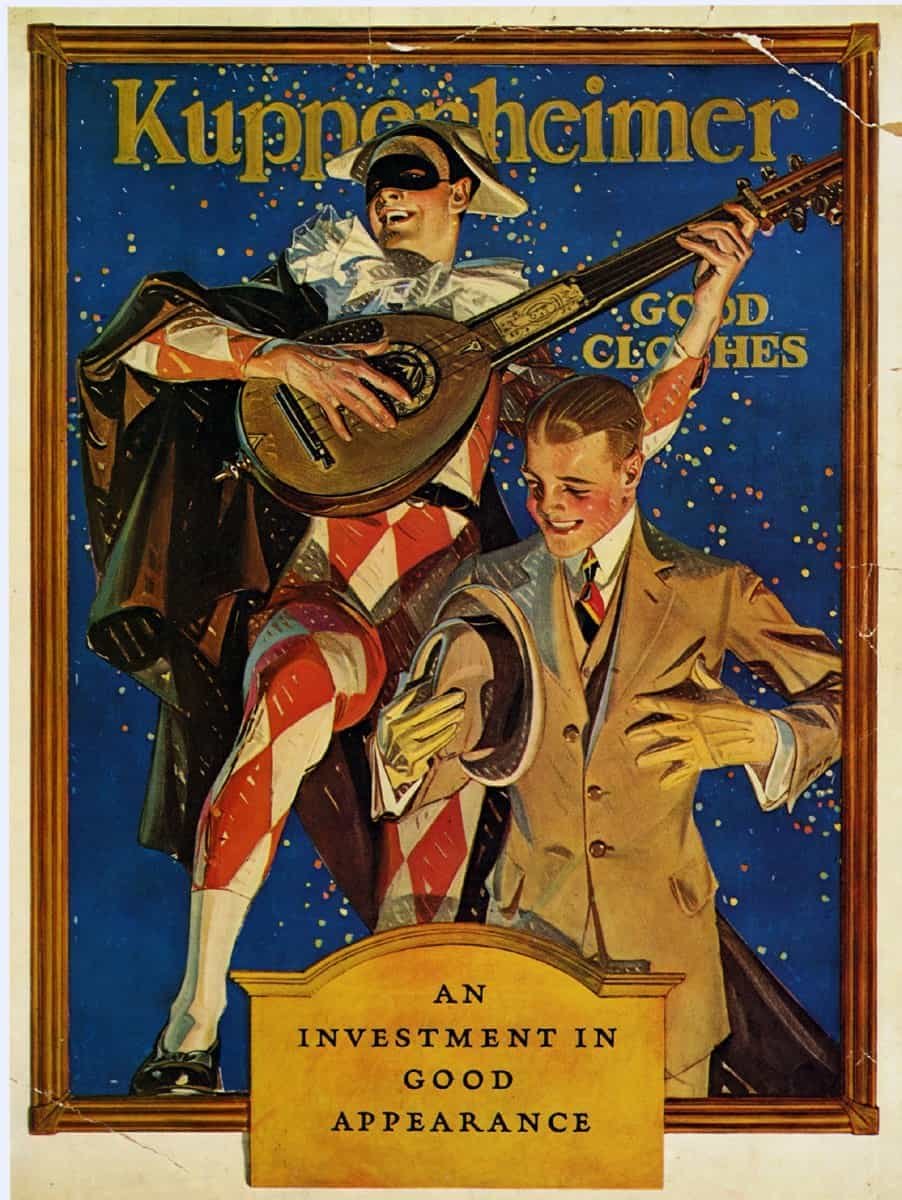
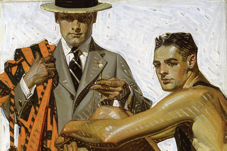
Leyendecker’s men, on the other hand, are all about status. His magazine ads showed men in finely pressed suits, expensive homes, well groomed and accompanied by beautiful women. Status was an enormous selling point in the early 20th century and our lead tenor Milio Dufresne’s web of lies is certainly partially based on maintaining a certain status within his community. More on Milio’s motivations will be explored in the next blog post.
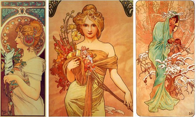
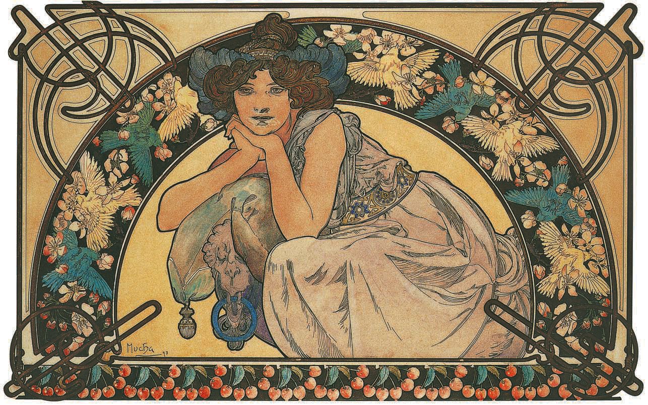
Alphonse Mucha
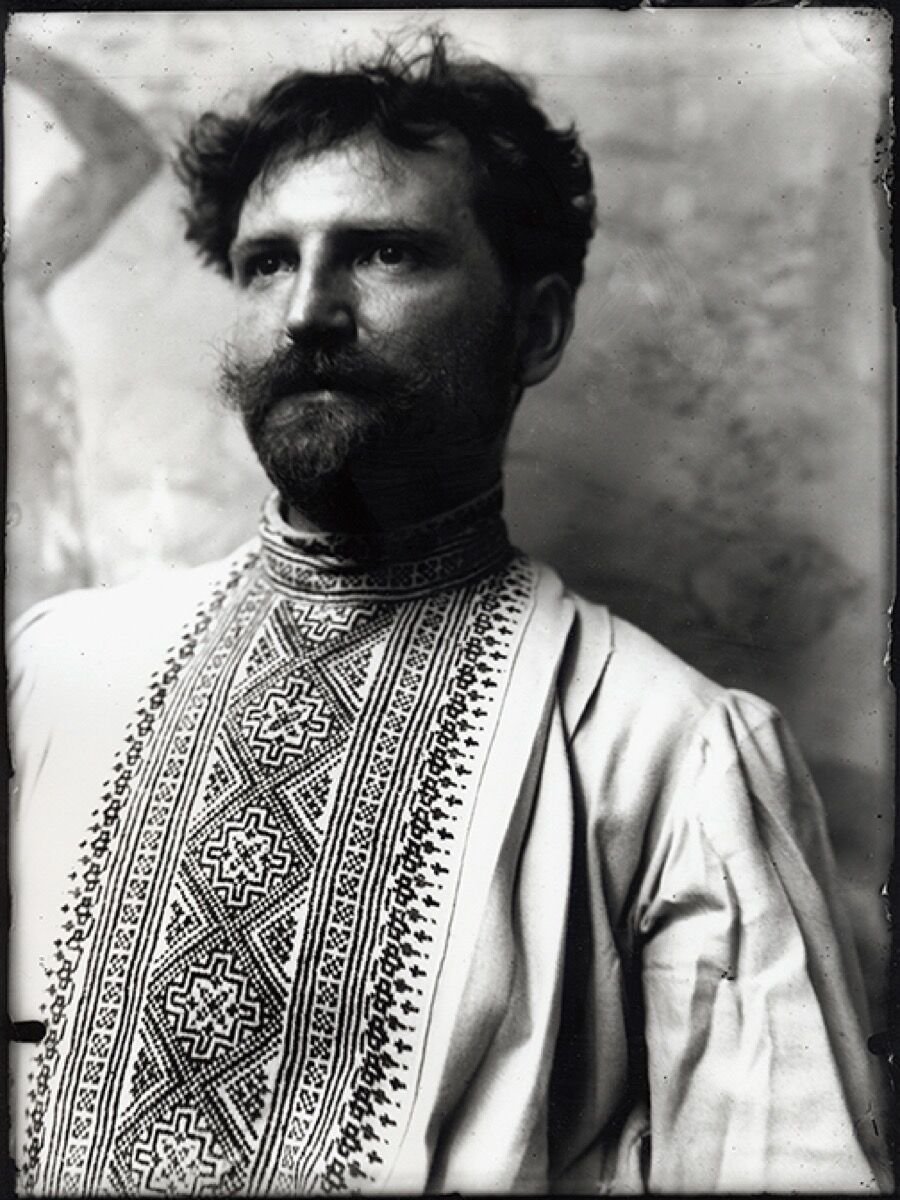
Alphonse Mucha
The name of Czech artist Alphonse Mucha (1860-1939) is synonymous with Le Style Mucha, a decorative art form that made the artist famous in Paris at the end of the nineteenth century. Today, Alphonse Mucha is recognized for the bridge he created between ‘high art’ and commercialism. Mucha was able to straddle both worlds: to create an artwork that could be used for a poster illustration for cigarettes and, at the same time, produce a series of historical paintings such as the Slav Epic, which remains a powerful contribution to Czech art history. A study of Mucha’s life allows one to fully explore and understand the context of Paris at the fin-de-siècle: a fabulous period to be an artist if you were successful: appallingly hard if your work was not recognized. Mucha lived and worked in PAris for nearly 20 years, from 1887 to 1906.
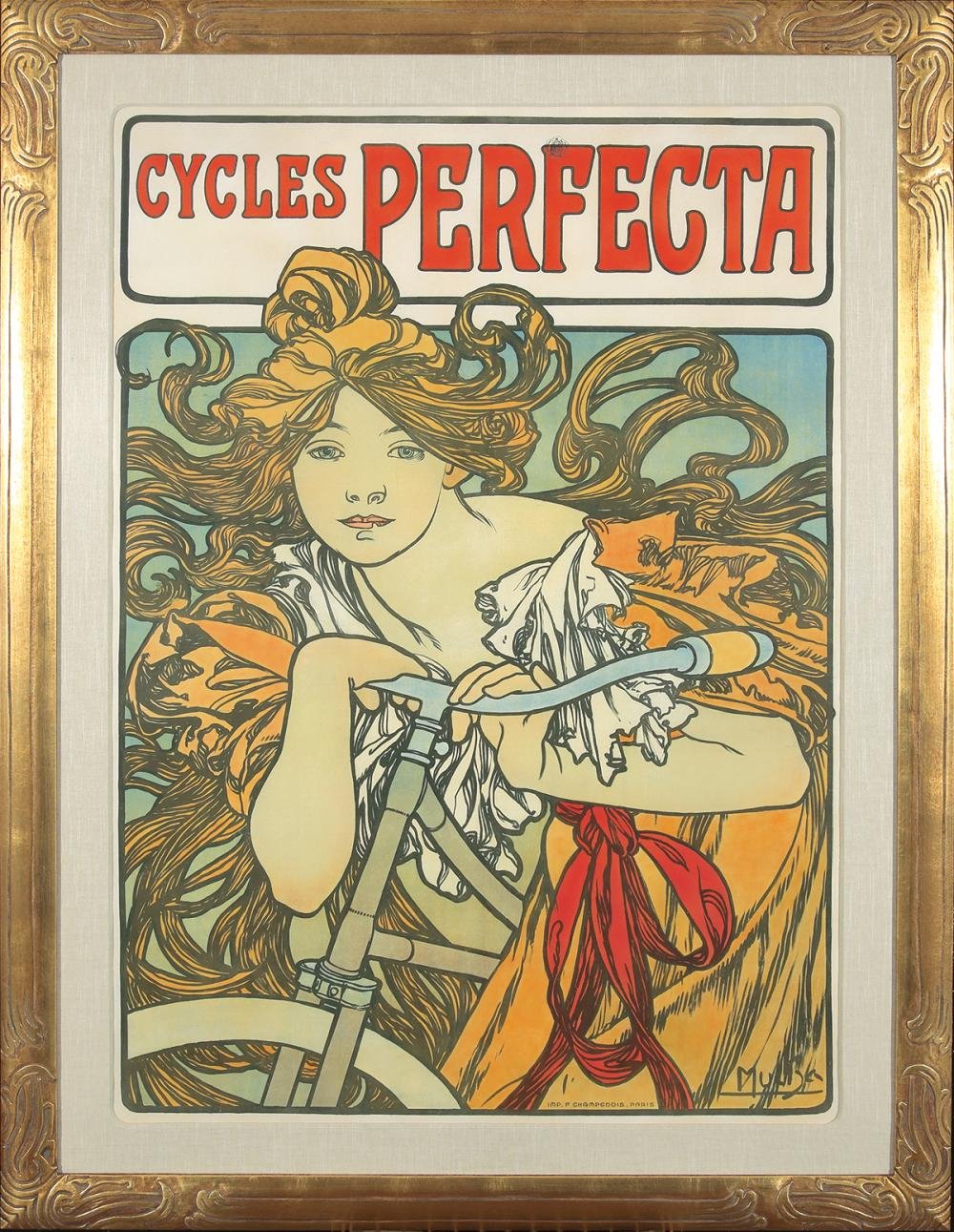
Mucha moved to Paris to study as an artist, at first as the protégé of a wealthy patron, and when financial backing ceased, as an impoverished artist living on a diet of beans and lentils, enduring cold winters and bare accommodation. When fame came to him, he shared it with his less fortunate friends; he was a generous man, who never forgot his own periods of hardship. His chance at fame came through a rush job to create a graphic design for a theatre poster for the globally famous actress Sarah Bernhardt. She liked his work and signed a six-year contract, guaranteeing him success.
It is perhaps because Mucha’s success was gained through commercial illustration that he is not immediately linked to other artists of the period like Paul Cézanne, Claude Monet, or Edgar Degas; yet Mucha, like fellow graphic illustrators Henri Toulouse-Lautrec and Jules Chéret, was creating art in the context of life in Paris. Their illustrations are a historically important document of graphic design of the era. The growth of the publishing industry required illustrators; it was his means of survival. His peak years 1893-1903 perfectly encapsulate the fin-de-siècle era.
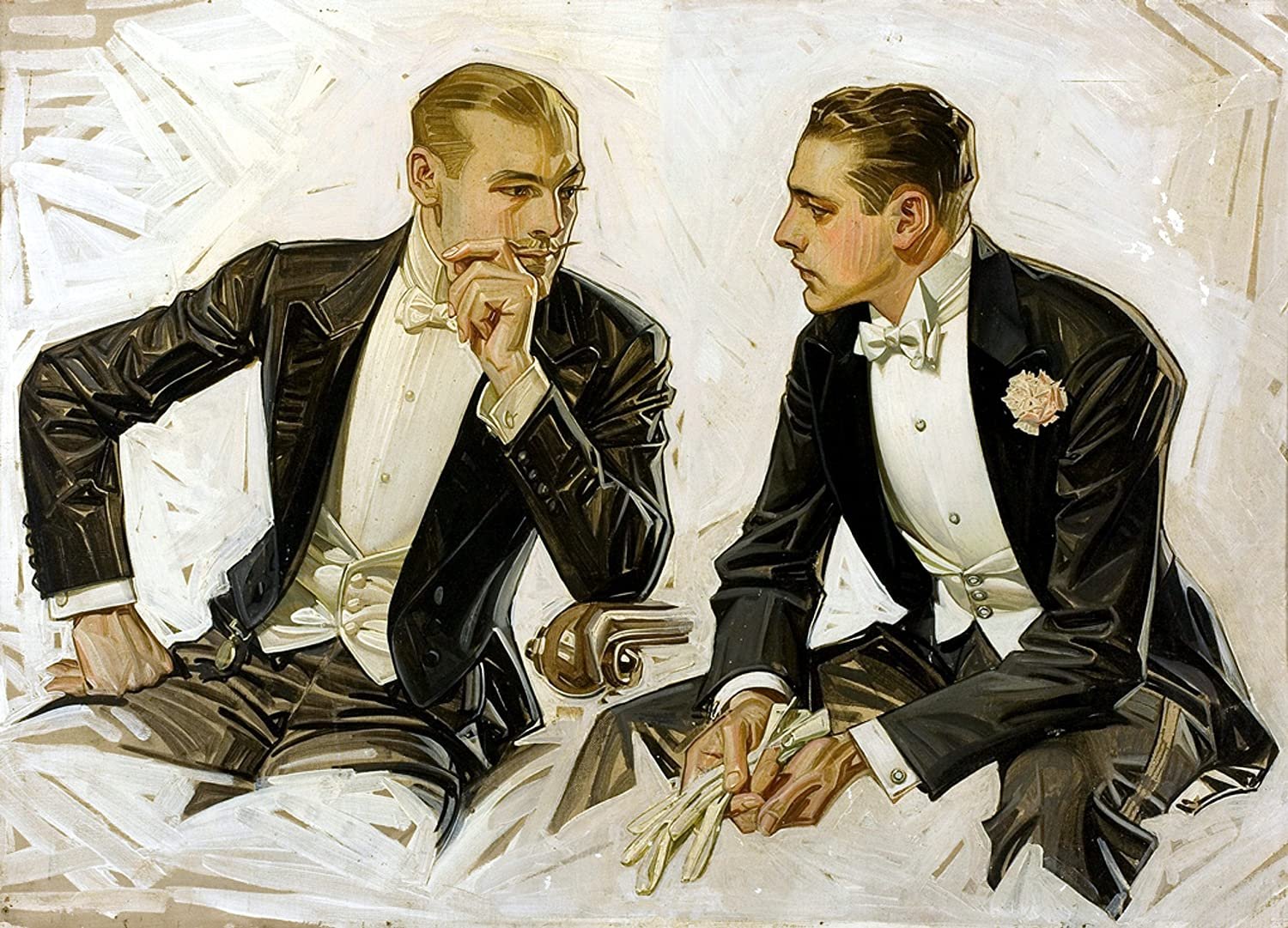
J.C. Leyendecker

During his life, Leyendecker’s paintings on magazine covers and in advertisements were widely recognized by admirers nationwide. He was the most popular illustrator of his day and was published in the most popular magazines. Yet he moved among commuters on trains, mixed in markets and shops, on high streets, virtually unrecognized by his adoring public.
J.C. Leyendecker (“Joe” to family and friends) was a mysterious figure who shied away from the limelight and its consequent public scrutiny. Nevertheless his fame and accomplishments as an illustrator were legion and lasting.
Joe Leyendecker was a gay man when it was nearly impossible to live such a life openly. While gay subcultures existed in the beginning of the twentieth century in New York and San Francisco, the homophobic disease was prevalent throughout the country. In Leyendecker’s later years, Senator Joe McCarthy was on his anti-Communist tirades and anti-liberal witch-hunts, and it seemed that the whole world was intimidated by all-pervasive prejudice. Such an environment clearly accounts for the lack of information on this important icon-maker, perhaps the greatest American imagist.
To conceal his gay lifestyle, Leyendecker meticulously cleansed his files and records of anything homosexually explicit or implicit. Only in his artwork can one find sex symbols and homoerotic images, which he caused to appear subtle or not so subtle. After his death, Joe’s life-partner for nearly fifty years, Charles Beach, had been ordered to destroy all records, correspondence, even remaining original artworks.
While always sought after by the press, Leyendecker rarely gave interviews or permitted photographs. Consequently, there are very few photos of him or Charles Beach. Beach was his favorite model, and together they became the prototype for same-sex couples of their generation. Today they are recognized by the LGBTQ+ community for their long-standing domestic partnership, alongside the likes of filmmakers Merchant & Ivory; J. Edgar Hoover and Special Agent Clyde Tolson; Michelangelo and his muse, Tommaso de’ Cavalieri; and the notorious Oscar Wilde and his lover, poet Lord Alfred “Bosie” Douglas of Hartwick. (Coincidentally, Joe treasured Wilde’s writings—he read everything by Wilde, keeping his works on a shelf in his studio—and also the gossip whirling around his relationship with Bosie.)
-Laurence & Judy Cutler, The National Museum of American Illustration
Leyendecker and Rockwell
In many ways, the man whose name is considered to be synonymous with American illustration—Norman Rockwell—modeled himself on a now lesser-known artist, one of his self-proclaimed idols, J.C. Leyendecker.
In 1960, Rockwell included a chapter on J.C. Leyendecker in his biography, My Adventures as an Illustrator. Rockwell claimed to have followed Joe about town, emulating his stance, swagger (limp), and “attitude” of the man he and America considered the best illustrator. As a budding young artist with high hopes of rising the same exalted plateau—the preeminent Saturday Evening Post cover artist—Rockwell was consumed by the man and his art. When the opportunity arose, Rockwell, an agressive up-and-coming competitor, picked Joe’s brains for ideas, for contacts, and ultimately for clients. The shy Leyendecker, unaware of Rockwell’s competitive nature, naively revealed his contacts. Less than a year later, in 1916, the Post, Leyendecker’s single most important client, commissioned Norman Rockwell to paint his first cover. For some time, they both produced Post covers, but Norman Rockwell ultimately supplanted his idol as the best-known cover artist for the Saturday Evening Post.
Rockwell virtually did everything possible to imitate J.C. Leyendecker. HE moved to New Rochelle to be near Leyendecker. He analyzed how J.C. developed his cover ideas. He studied his style and technique, using in his own work the same broad, white background strokes, projecting figures outside the cover frame overlaying the logo masthead, and painting caricatures. He imitated Joe so completely the public became confused as to the source. Leyendecker’s career slumped thereafter.
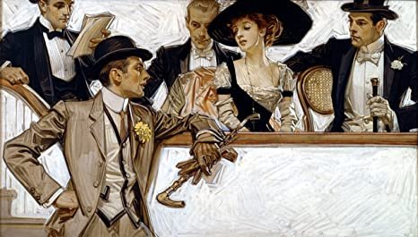
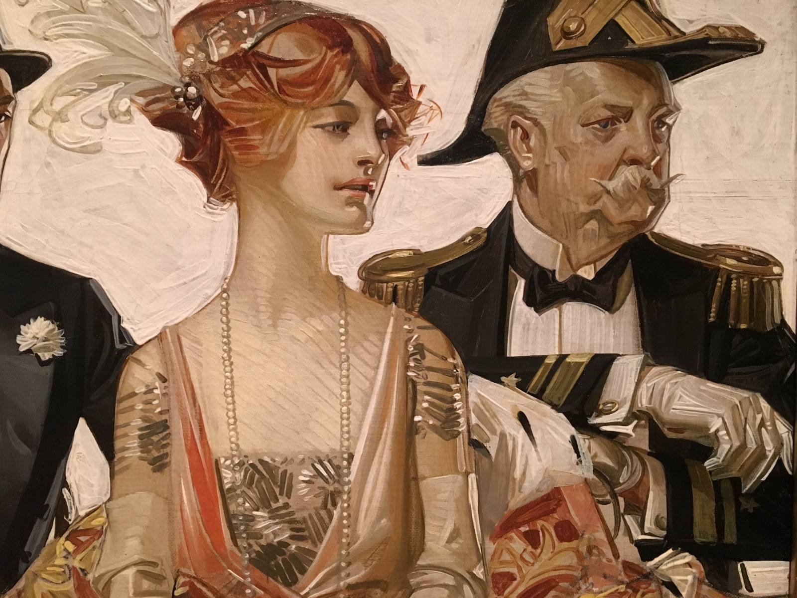
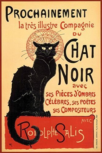
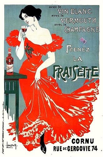
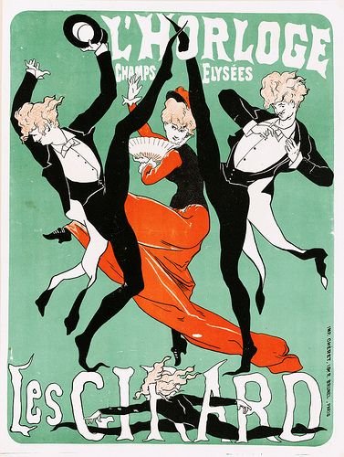
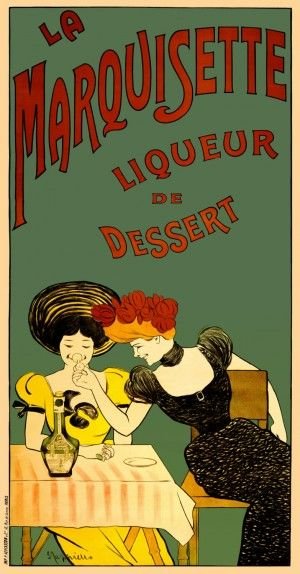
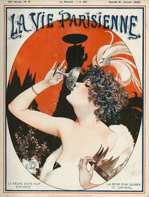
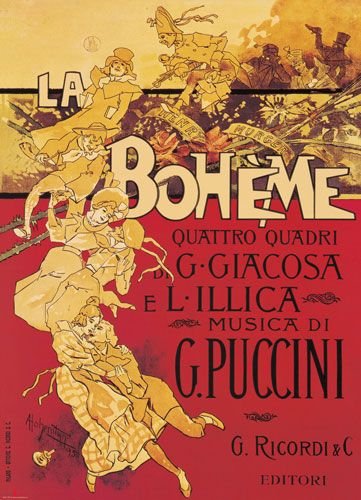
Fin-de-Siècle Theatre & Opera Posters
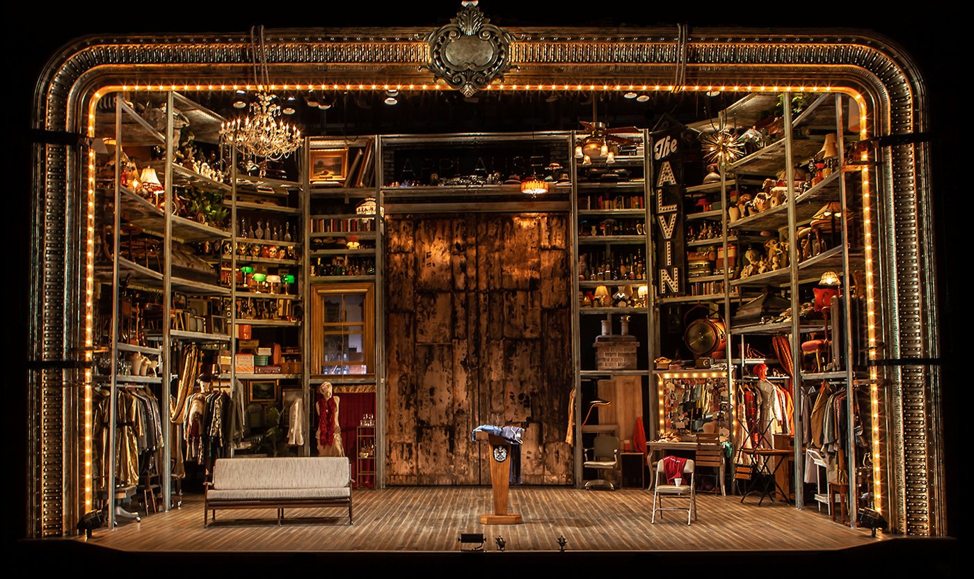
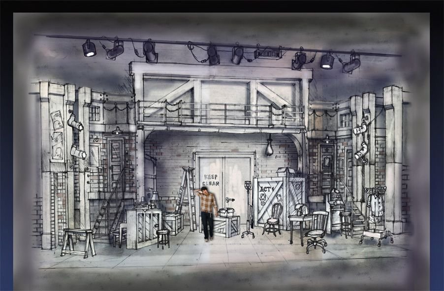
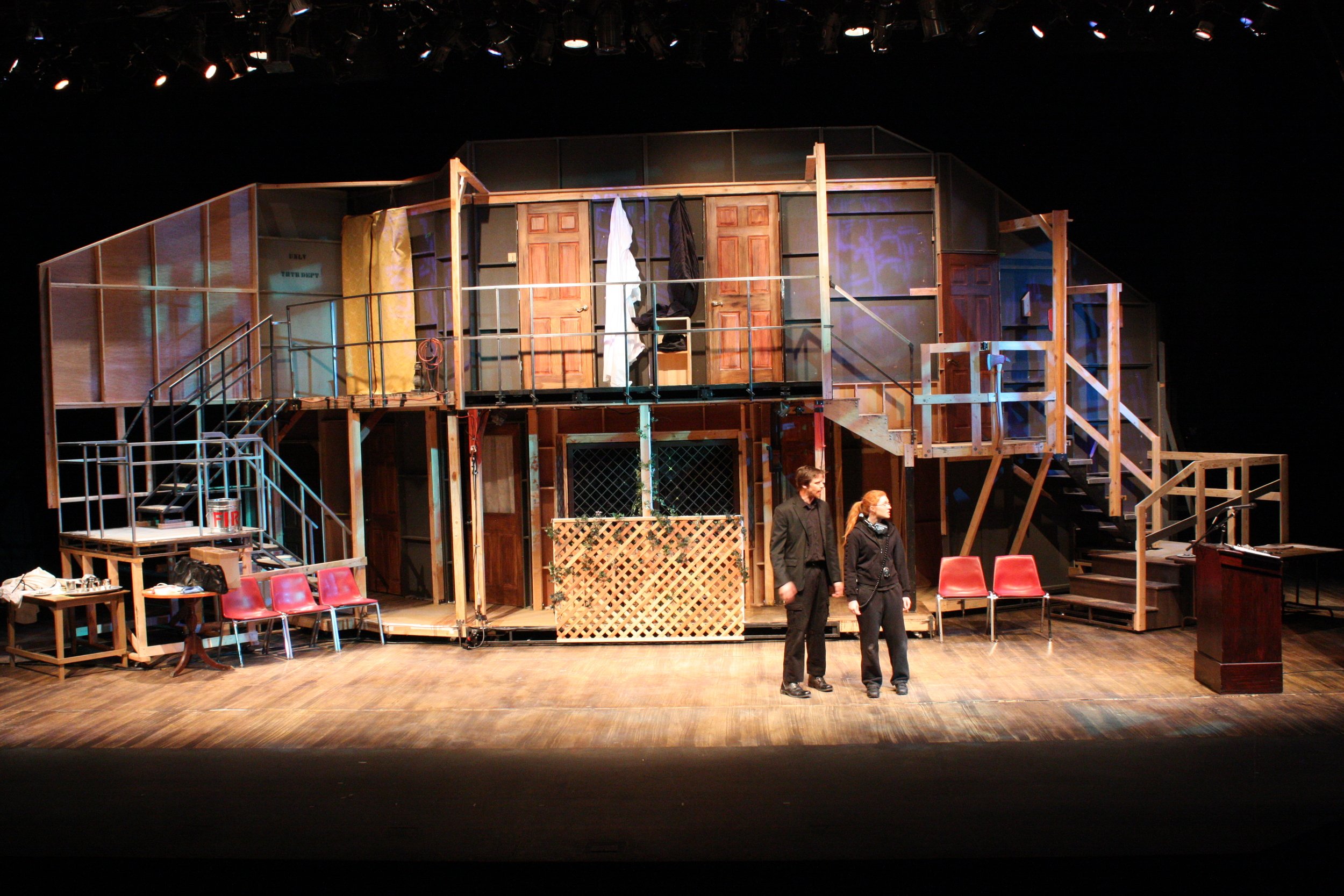
Because a large part of Zazà takes place backstage at the Alcazar music hall; A social hall similar to a cabaret or burlesque theatre, I wanted to stay true to my theme of sourcing the opera’s aesthetic from fin-de-siècle advertising art. The following images are some of my favorites from my research and will inform the design of the production’s publicity materials as well as the set dressing in the first act.
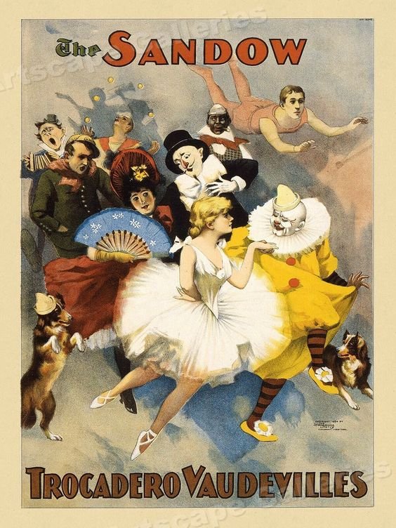
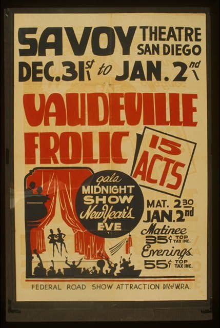
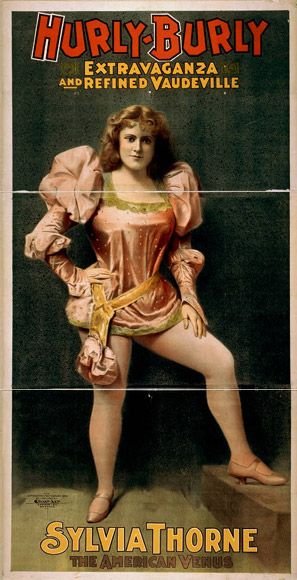
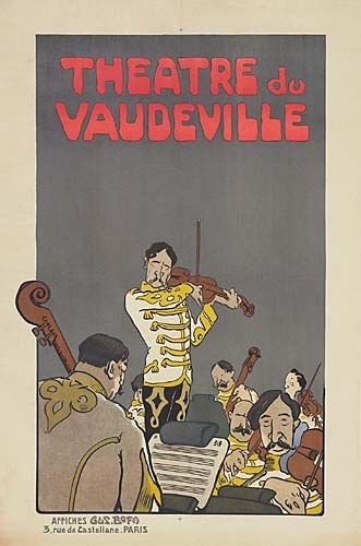
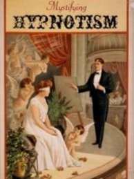
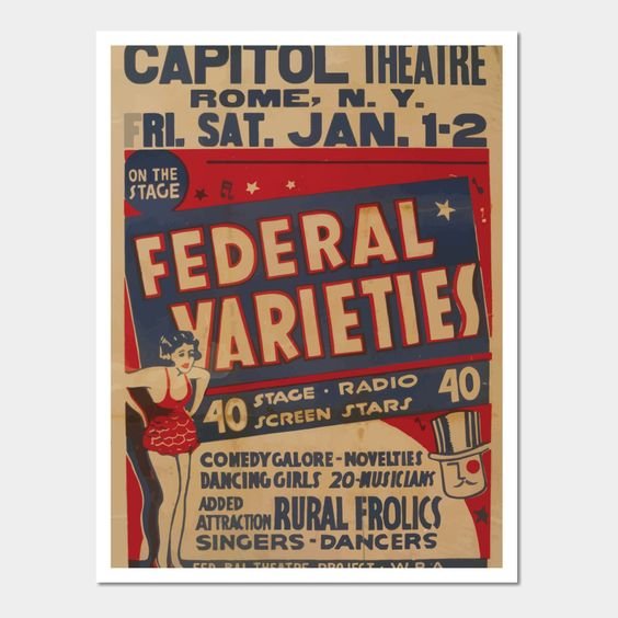
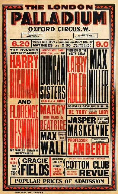
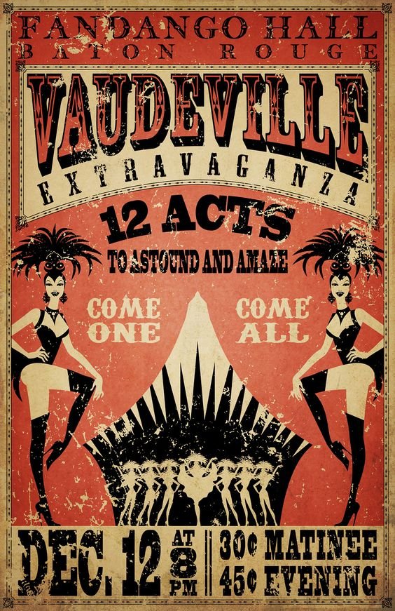
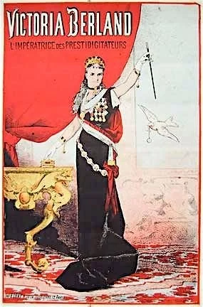
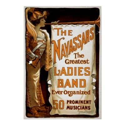
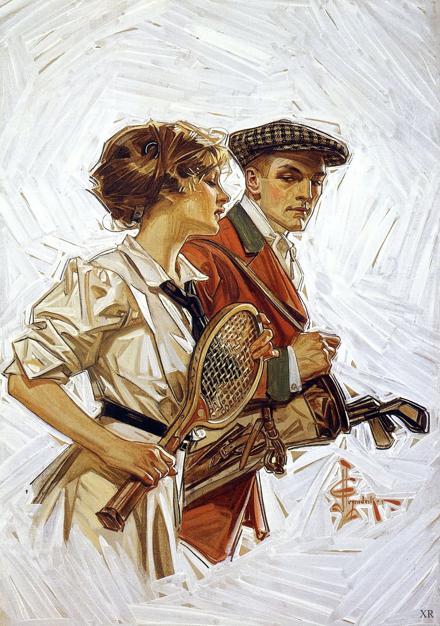
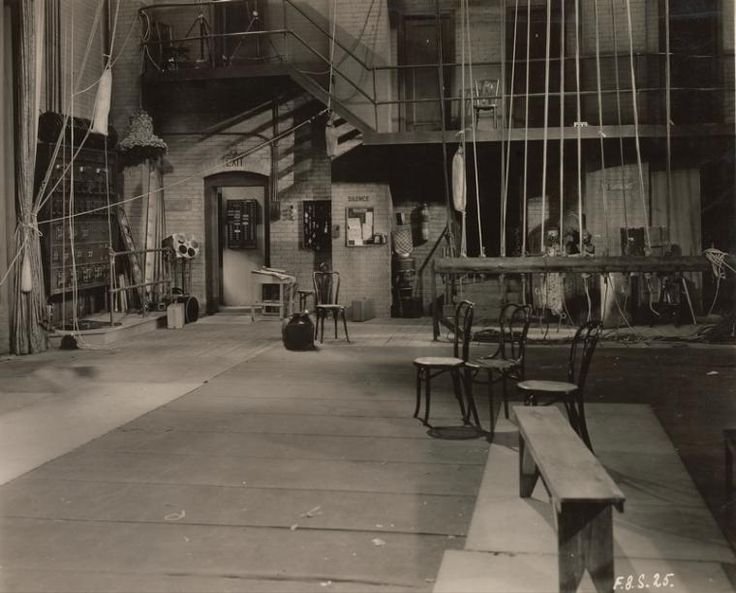
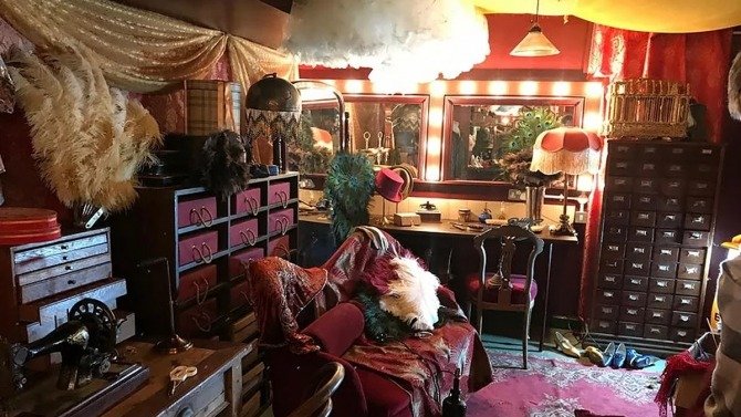
Scenic Influences for Act I
The first act, as mentioned, takes place backstage at a French vaudeville cabaret hall. The following is a mood board and resource library for the scenic design:

That’s all for now. The next post will discuss social and psychological themes in Zazà —specifically relating to relationships, infidelity, and how we deal with betrayal.
Until next time,
A